The Emerald Downs Redesign
A look at the redesign process and adding new features of the horse racing organization Emerald Down's website.

Overview
What is Emerald Downs?
Emerald downs are one of the most prominent horse racing organizations in the Pacific Northwest. It's widely known for its fun racing events with the community.
The Problem
Emerald down's website needs a proper rebranding of visuals and layout, especially in missing features like other horse racing websites. They also didn't know what their users wanted and guessed based on other horse racing websites.
There is also no design system in place, so the color palette, iconography, and typography were inconsistent or missing. This left users confused and uncertain about why they should use the website.
The Goal
To give a design system that will allow visual branding consistency and improve guidelines and direction.
An easy-to-use navigation and page layout for news, racing info, and to join the Emerald Racing Club.
A way for users to bet on races that stay true to the branding and complies with Washington gambling laws.
The Responsibilities
On a team of five people as the UI/UX designer:
Project manager
Front-end developer
Back-end developer
UX researcher
What I did:
User testing
Wireframing
Create design system
Prototyping
The Tools
Figma, Adobe Illustrator, Adobe Photoshop


Website Users Demographic
Emerald Downs's monthly unique visitors on the website are around 3,000, with 58% men and 41% women, and 57% of the users' age ranging from 30–49 years old.

User Interviews
Conducting User Interview
I started my user research by conducting user interviews with eight users and email surveys of over 13,000 mailing lists, which vary from weekly active users to infrequent users of the website, to understand what motivates or demotivates them from using the website and their information consumption habits.
I conducted some phone interviews while some I ran in person.
The male interviewees ranged from 25 to 49 years old, while three women ranged from 22 to 37 years old, which I felt was a fair representative sample of Emerald Downs's current viewer base.
Some key insights from the interview:
Almost all the participants visit the website once a week, mostly at night.
Most participants said the newsletters grabbed their attention, while some even felt it could get annoying. Very few left the website due to the newsletter pop-up.
The features they use most often are live streaming and recap videos.
Most said they want the website to show more information but would always want to be aware of vital information such as dates and horse changes.
Most participants want to browse just the events to stay updated quickly. If an event grabs their attention, they read it and want it to be clear and to the point.
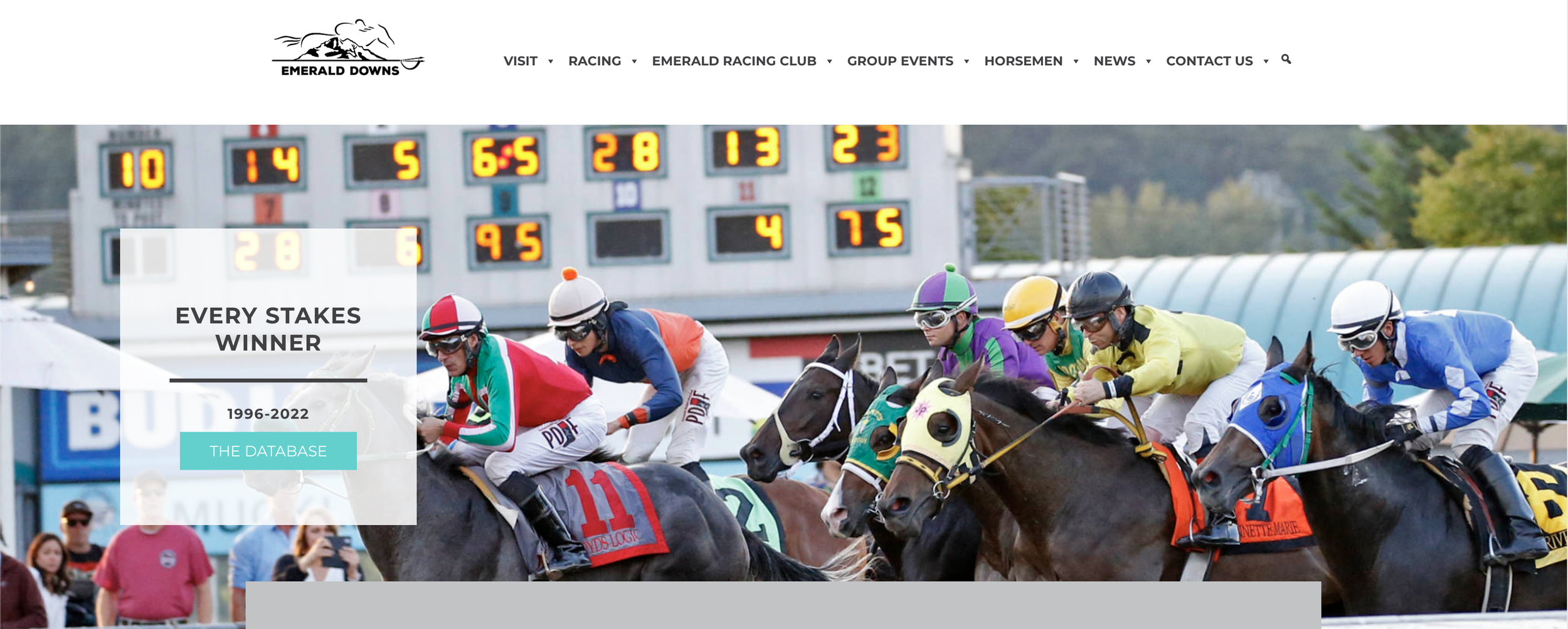
Emerald Downs' Old Website


Understanding the Existing Users
Usability Testing
After the user interview, I asked the same participants (eight participants) to test the Emerald Downs website (Virtual and in-person Usability Testing).
I wanted to see how they would interact with the website’s features.
Some of the tasks that I gave them during the testing were:
Visit the website and read the news, videos, and live stream
Sign up for the Emerald Racing Club
View the calendar
View the racing charts

Defining the Problem
After identifying and analyzing pain points through user research, I defined the following pain point that most users had trouble with.
Pain Point 1- Incomplete mobile website
Multiple users expressed that they would prefer the mobile site, as the Emerald Downs mobile site lacks the complete set of features as the desktop site version. Users pointed out that the mobile version was not as user-friendly as the website. They also suggested that they would prefer the mobile site if the app followed the website's footsteps.
"I am disappointed, and I'm not always by a computer, and I rarely face any problem with that."
Pain Point 2 - Confusing and cluttered UI
Most users complained that UI made reading impossible, and had to keep scrolling horizontally to find relevant news. Font and spacing made it look overpopulated. Most of them found the body text font small and the heading font large, leading to a terrible viewing experience.
"The moment I clicked, I felt like I was fighting to get the horse racing info I needed."
Pain Point 3 - No access to online betting
Almost everybody showed their frustration about not having access to online betting. Every user expressed a need to have at least a proper way to find out how to do so.
"I don't know where to bet, and I hate having to go somewhere else to find it."
Pain Point 4 - No recap videos
The user wanted more segmented news to browse through various categories. They felt there was no organization of news, videos, or information.
I know there’s great content, but I can't find any categories! Why would I waste my time on this?
Wireframing based on the problem
Easy layout
We used heat maps from Hotjar that showed where people looked the most. Using this information, I outlined what information can be delivered with as little interaction as possible such as a sidebar of event info or other relevant articles.
Easy navigation
The users wanted the betting and race recapping to be easy to find. People could see it by adding them in the navigation bar and separate panels on the homepage.


The wireframing of the Emerald Downs redesign
UX Suggestions and the Redesign
The proposed solution of the redesign.
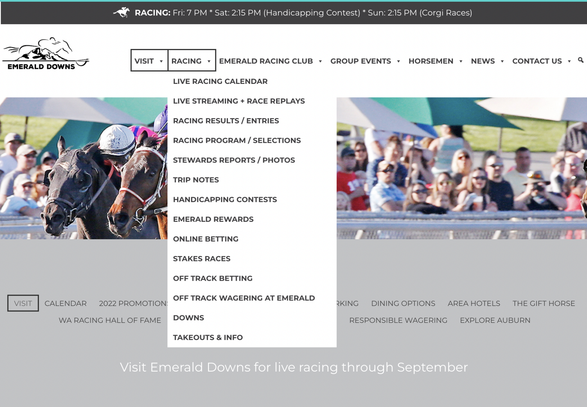
1. More features in the navbar
Having more straightforward navigation was the primary focus of the redesign. Emerald Downs wants to include many different features and events, so the menu must reflect that.
2. Race replays and updated betting information
A prominent feature that needed to be added the most was based on the user interviews. I've made sure to include updates and other opportunities for marketing via social media to help promote the races for those who couldn't attend.
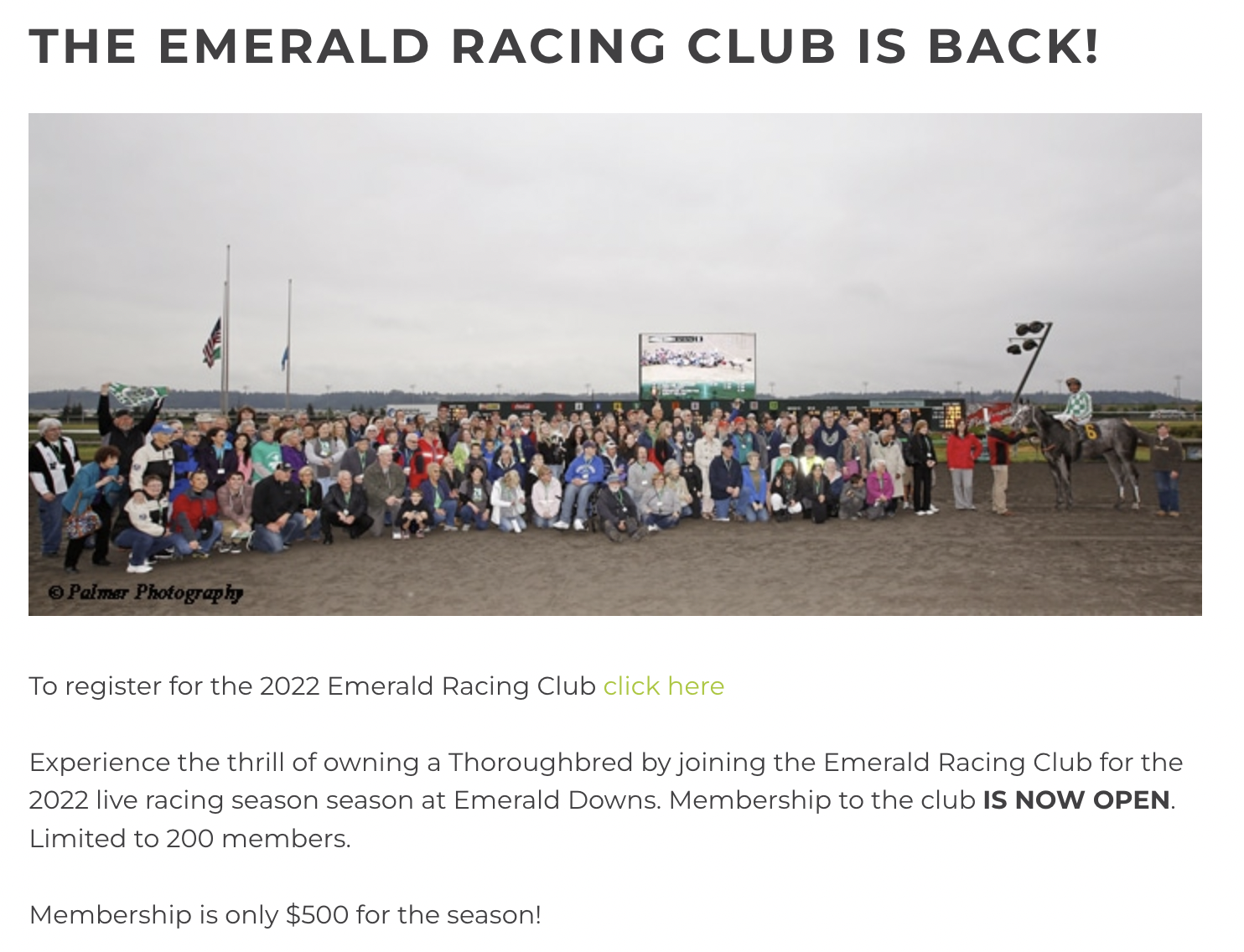
3. A dedicated page for Emerald Downs Racing Club
The Emerald Downs Racing Club is a seasonal membership that gives unique access to areas, outfits, and passes for all races. I wanted to highlight the main features and why people want to sign up. Also, showcasing previous members’ positive experiences.
4. More focus on events and news
This section gives a glimpse of all the latest happenings and media organized into categories to give the user an idea about the content. I added categories like 'press confidentials' and 'tv and radio’ so there are more accessible ways to get the information.
New menu system
The user can now find events, memberships, races, and news as efficiently as possible.
A 360-degree virtual tour of event rooms
Now the user can see themselves at the event without having to be there to know if it's the right place.

Social media updates on the home page
The user can now get a glance at what the latest update is. It also allows Emerald Downs to get more engagement on their Instagram and Twitter pages.

The Emerald Downs Racing Club
The user can find all the information to see how and why they should purchase a membership.
With the HotJar heatmap on the webpage, we found sidebars to be used more often than placing them below the content.
Upcoming events page
A calendar system for the user can visually see the events of Emerald Downs in advance.

The News and Media page
It is now sorted based on categories for the user to find what they want.

The race betting system
Now the racing system has a lot of information, from online betting to offtrack betting and race results, all available on the website.
We had to be careful with the legal terms to comply with Washington State’s gambling laws.

The Emerald Downs Design System
The design system goals
Ensuring UI consistency (often associated with increasing brand trust).
Reducing complexity and ambiguity.
Enabling and facilitating collaboration and consensus.
Creating a foundation for further improvement.
Typography
The Montserrat typeface was chosen because the geometric shape of the letters and the spacing between characters is perfect.
It's also super versatile, having several variations in weight which make it look great as a heading font and body text.
As shown through the three variations, this is the only typeface used in Emerald Down’s branding to keep simplicity and legibility on all mediums.

Iconography
In the Emerald Downs design system, I designed the icons to be simple, informative, and complement the overall visual language of the design system.
This simple icon set helps detailed icons decrease the cognitive load by focusing on simplicity and recognizing them on smaller screens.
Color palette
Although I value an aesthetically pleasing use of color, I value clear communication more. Color supports the purpose of the content, communicating things like the hierarchy of information, interactive states, and the difference between distinct elements.
To me, colors should have meaning and be selected intentionally. Not based on what you like or what you think looks good.
We made an A/B testing among these shades of greens to an emerald color. We found no difference in the user’s enjoyability or usability of the website so we decided on the client’s choice to have this color palette.

Documentation
A shared space where you say when and how to use the design system.
Visual language
Guide to what the brand feels like
Pattern library
Also called a "component library," it includes buttons and a layout to be reused.
Brand guidelines
Includes principles, tone and voice, writing style, and more.
After auditing the pages and collecting the differences from one another icons, I merged them, which is the design system's overview result.
The Foundation
The spacing and grids are some of the most overlooked elements in visual design, but they can make a massive difference in the look and feel of a design.
For Emerald Downs, I went with an 8pt grid system that consists of a 12-column grid and an 8px baseline grid. I went with a rem-based guide for the spacing system that aligns with the 8px grid.
I went with an 8pt system to help the design system be more responsive because all of the top screen sizes are divisible by 8 on at least one axis. This is important as it will help prevent anti-aliasing.

The results of the Emerald Downs’ website redesign
Website time length increased to 230%
The bounce rate reduced from 84% to 36%
Emerald Downs Racing club sign-ups increased by 450%
The online betting page had the most traction
Twitter and Instagram gained 45% and 60% engagement, respectively.
The Project Learnings
What was the most challenging in this project?
The most challenging part was researching the brand, collecting demographics, data, vision, etc. Emerald Down's previous website experience made many people not want to use it, and finding those who did was difficult, so I had to look for outside sources.
Reflection and lesson learned
Looking back on the whole process, redesigning this website, and working on this case study reminded me that users are always the center of every design decision and the impact the smallest of things can have, such as changing an element's position.
I learned how to work with the stakeholder to provide evidence of data to support design decisions, such as colors, and focus on the most critical problems to solve.
With more time, I would love to work on the accessibility of the Emerald Downs website. Most notably:
Color contrasts to be able to read for the color blind.
Keyboard control to be able to navigate with only keyboard commands.
Content accessibility parses all images and videos to provide alternative text, captions, and audio descriptions.